B2B SaaS Platform for Nearshoring
Brand-Building Through Ad Creative @ Njord
The Challenge:
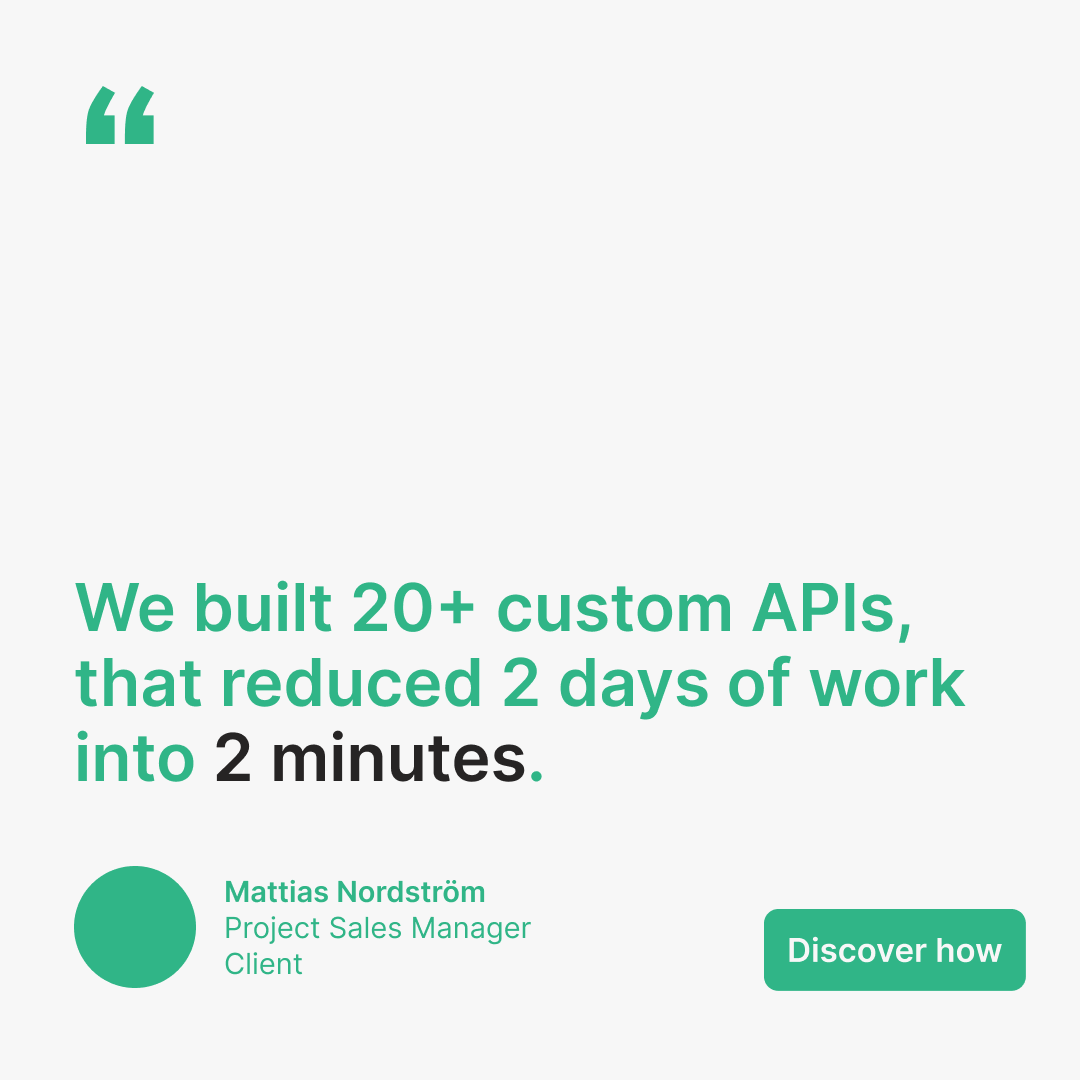
A B2B SaaS platform came to us without a fleshed-out brand identity. Their positioning existed mostly as abstract language, concepts and value propositions with no established visual system to carry them. The presentation of the brand was, in large part, left up to us to define through the ad work itself.
The Approach:

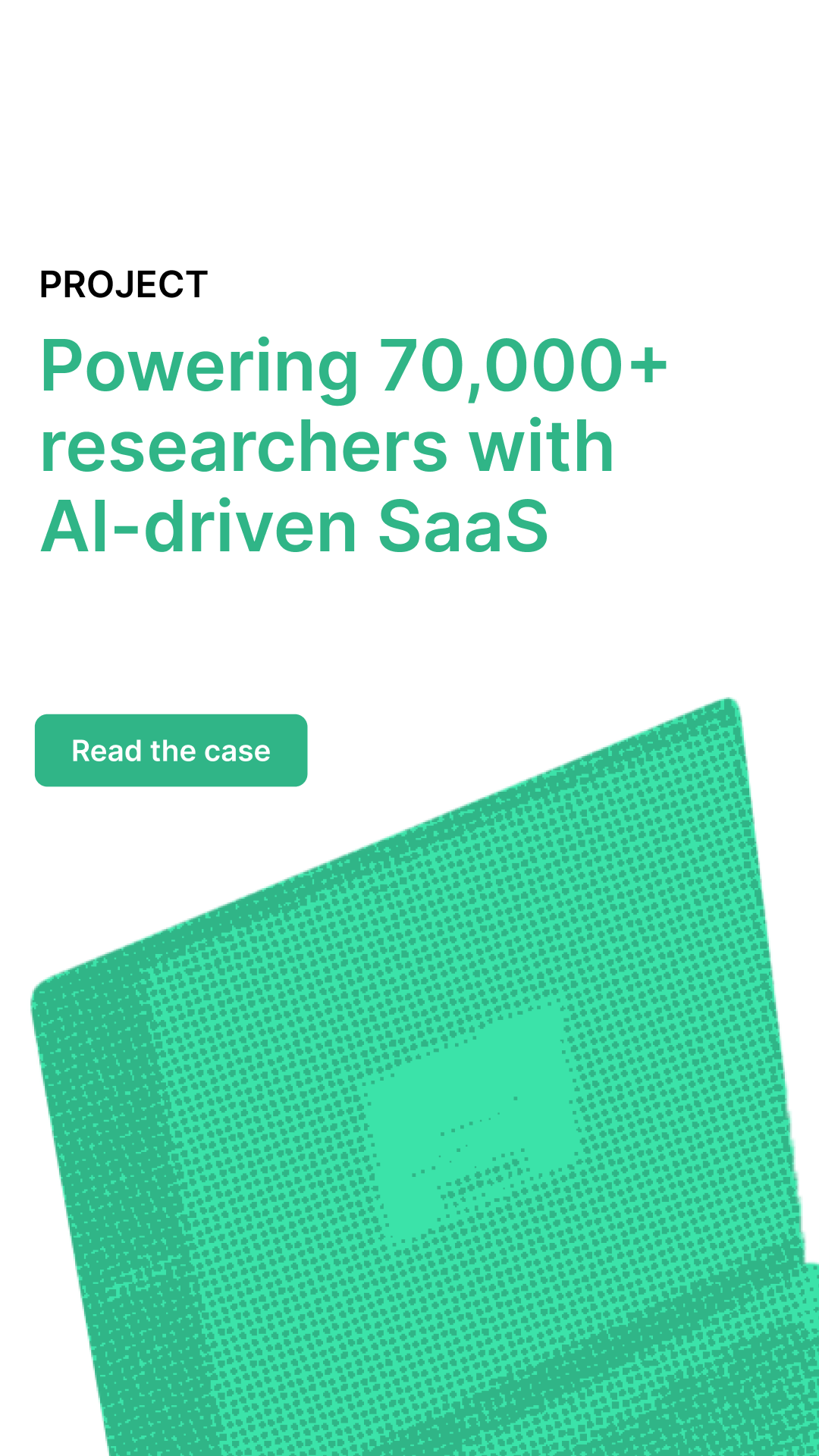
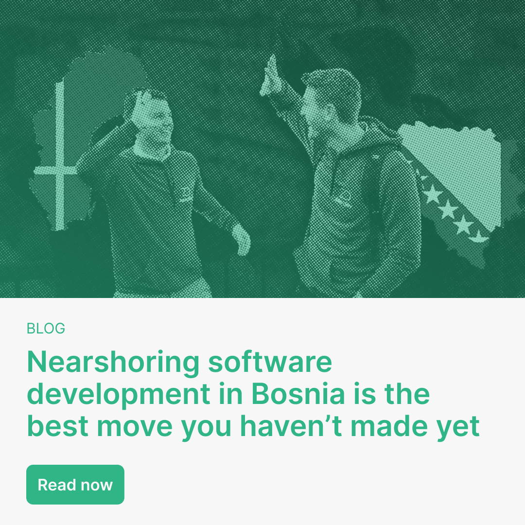
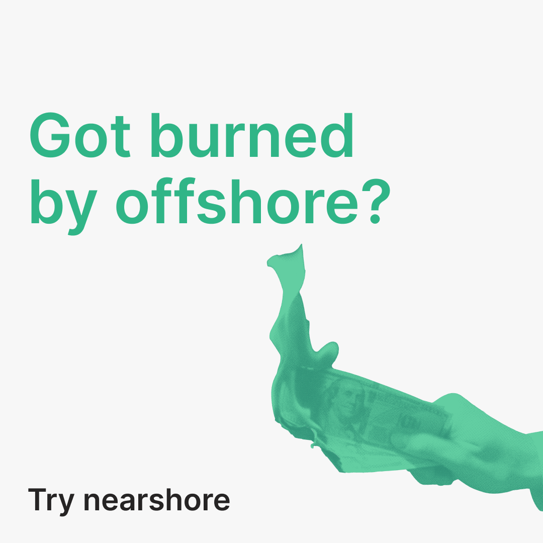
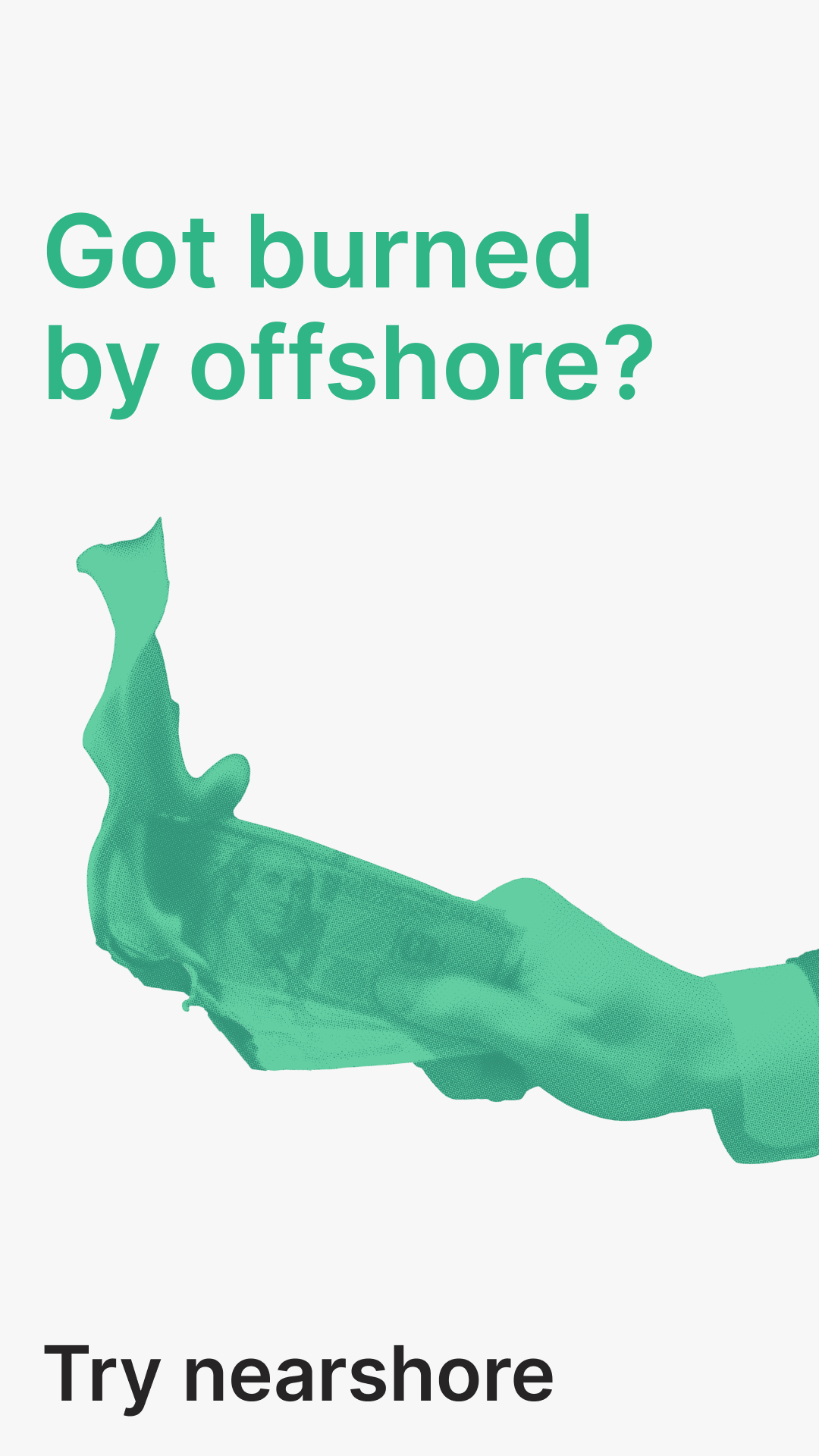
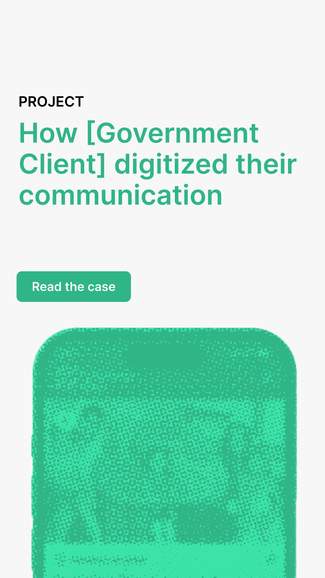
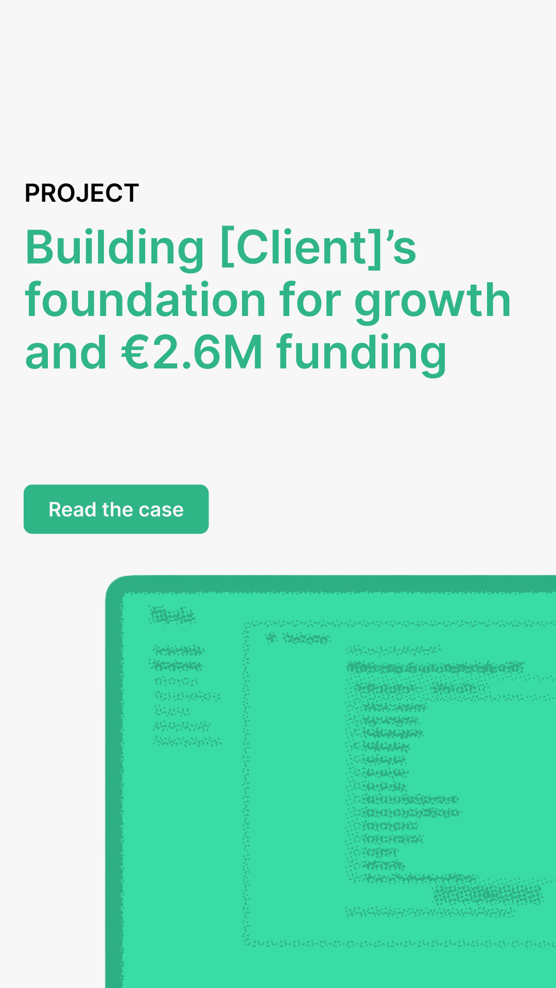
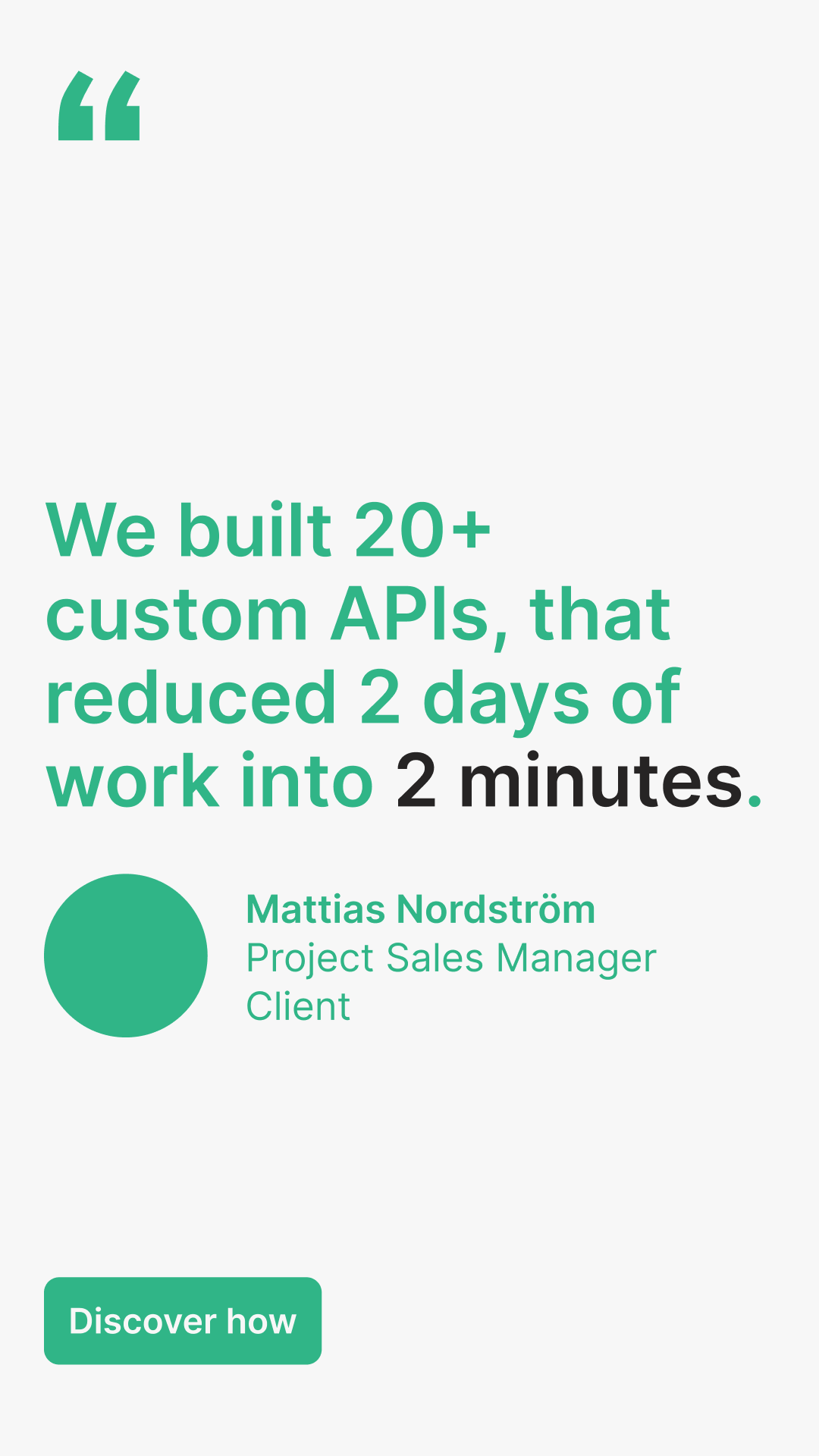
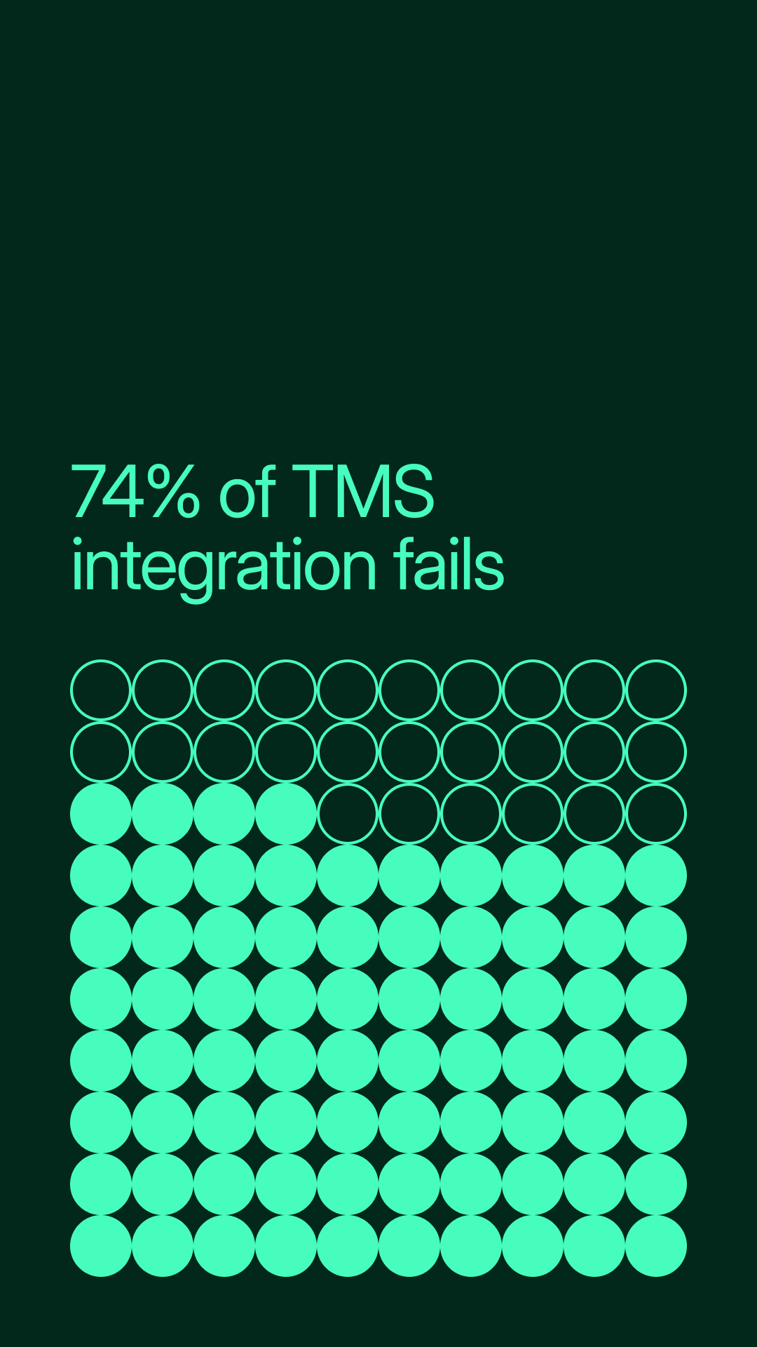
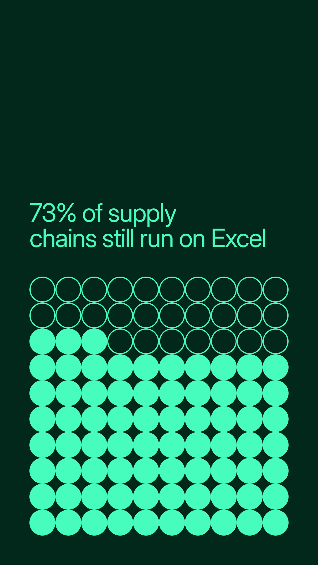
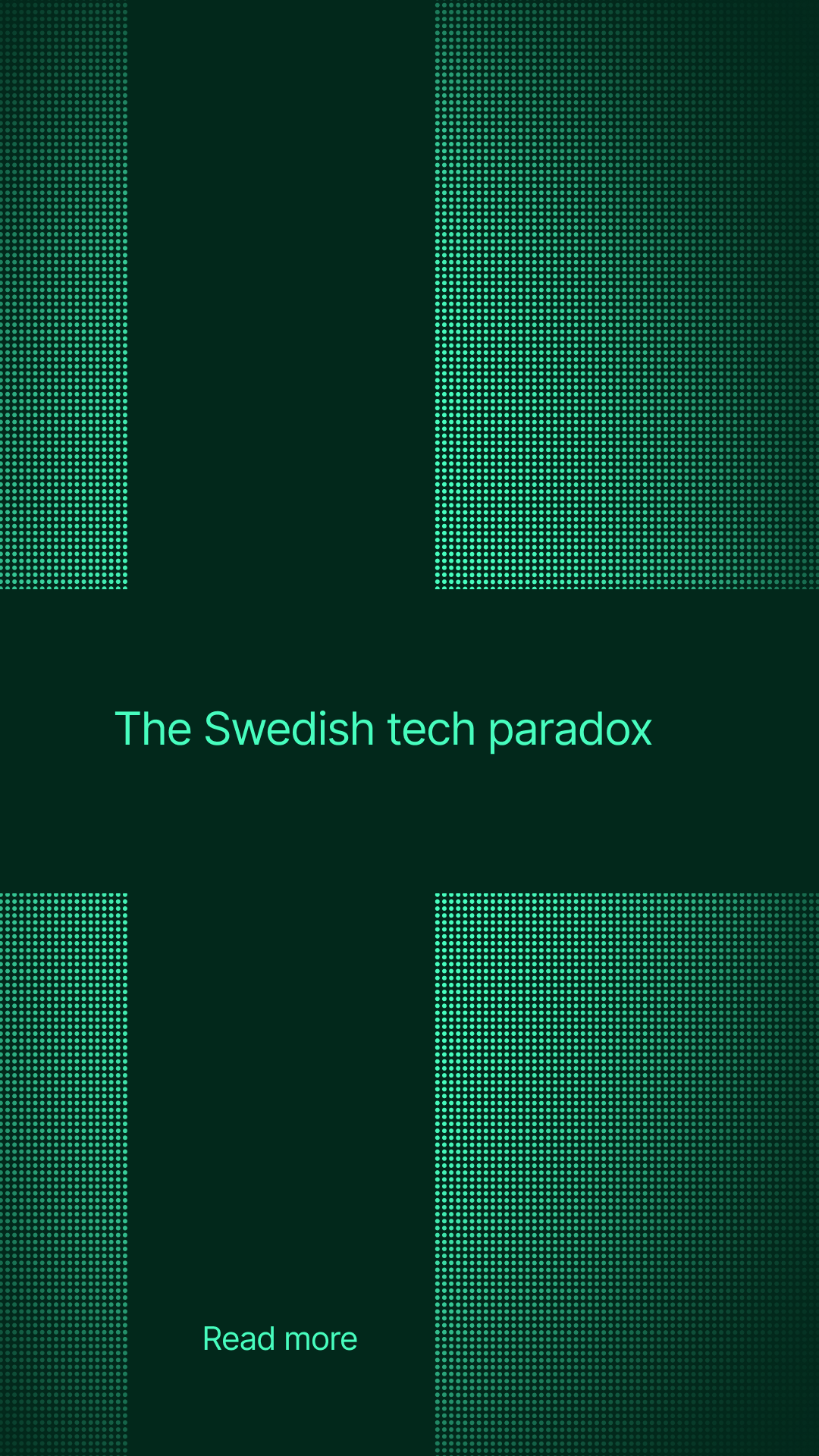
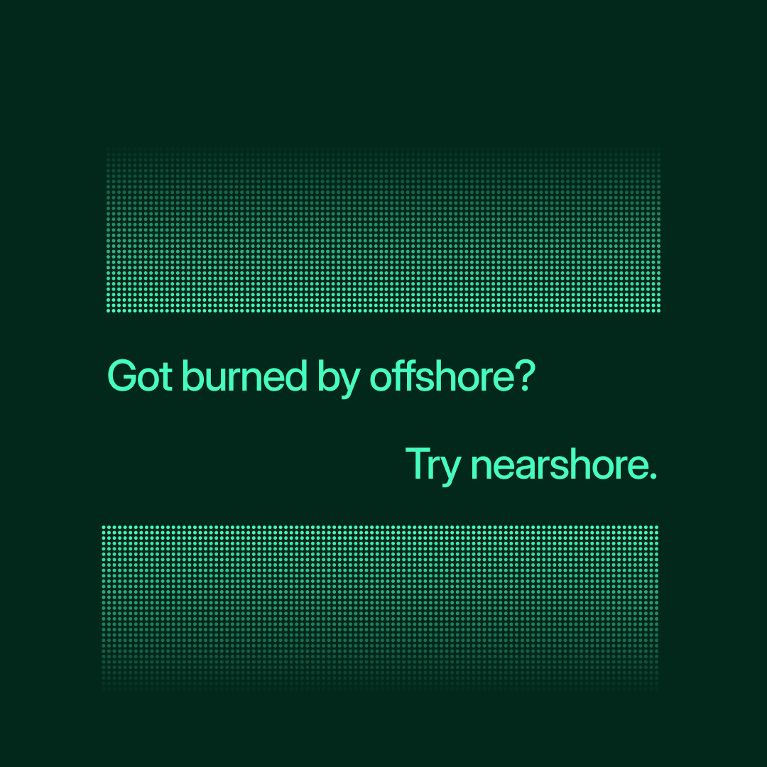
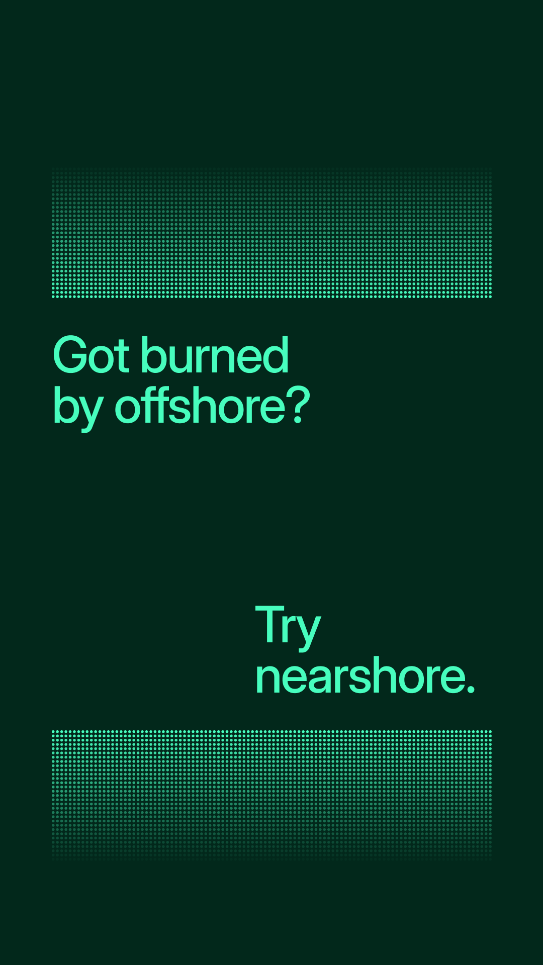
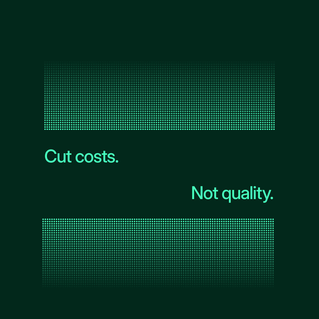
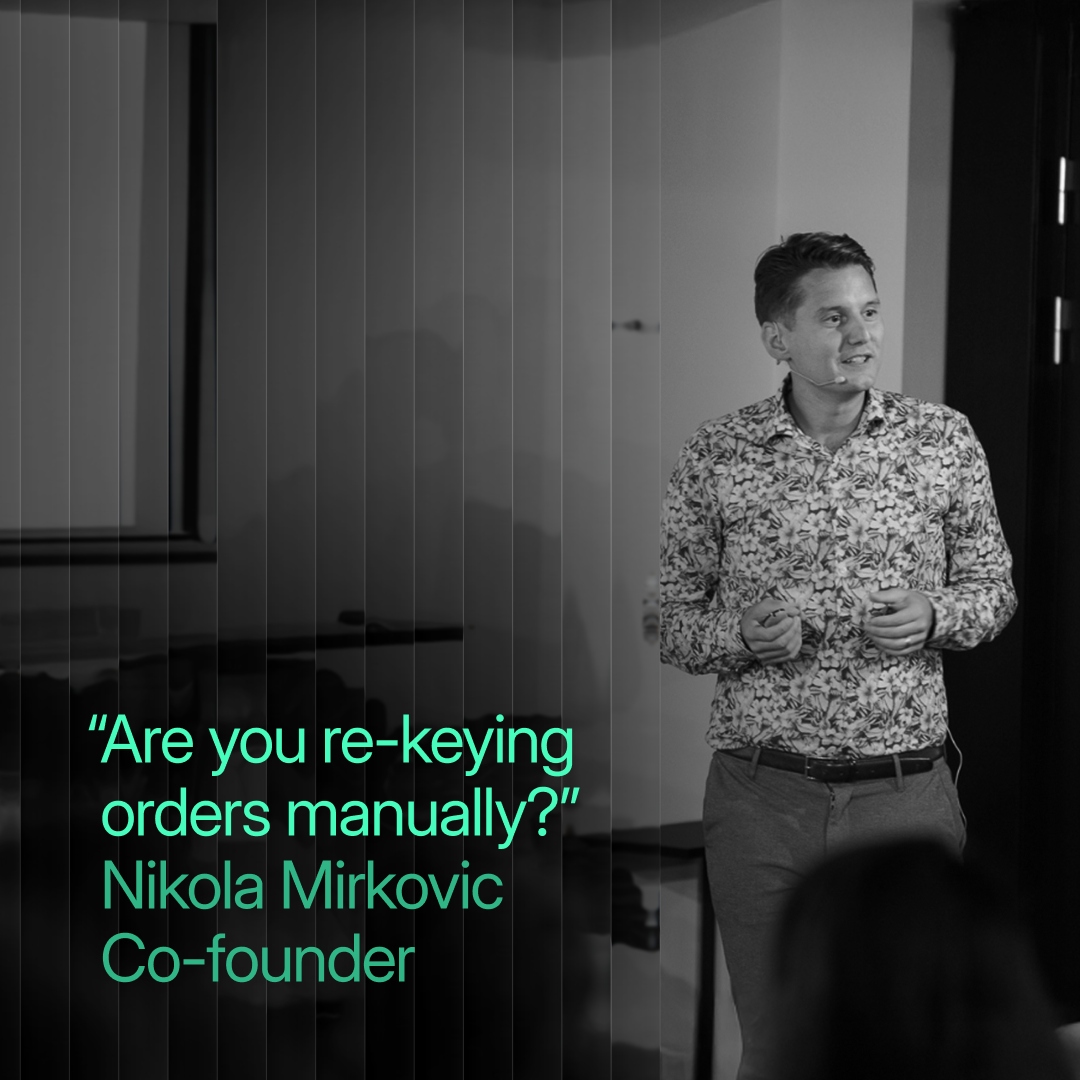
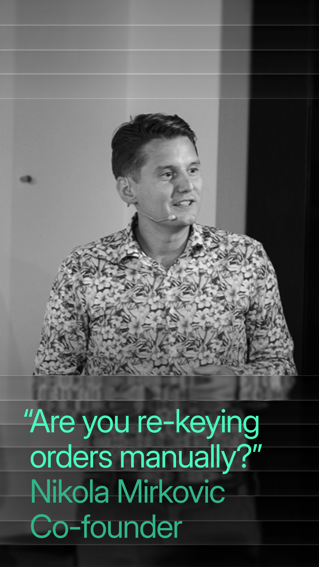
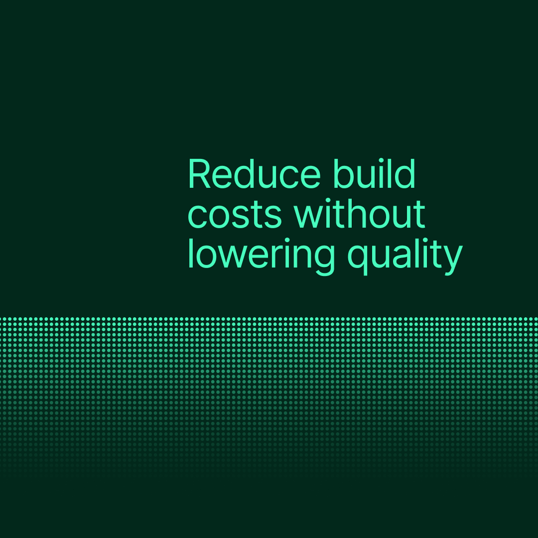
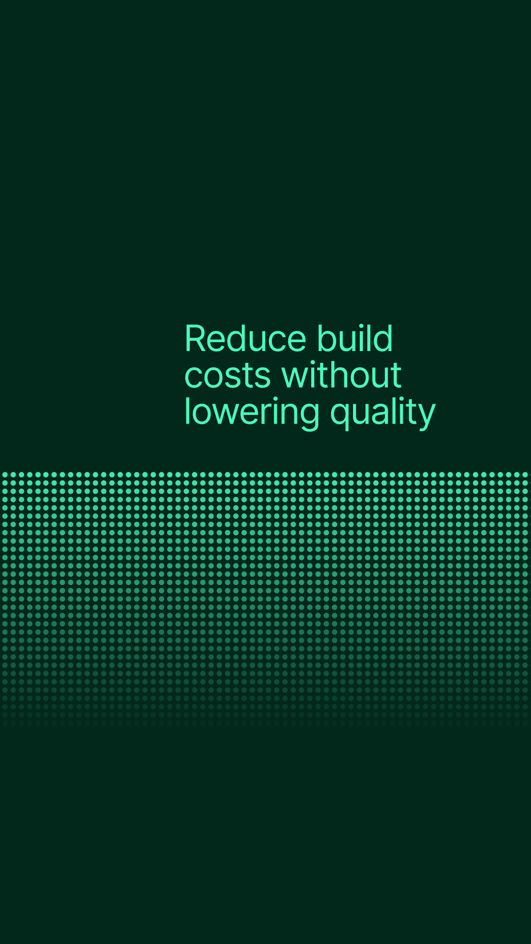
Started by translating the abstract into the tangible. Using the client's brand colors against stock imagery, developed a halftone illustration style for the initial batch of ads, giving the brand a visual signature it didn't have yet.
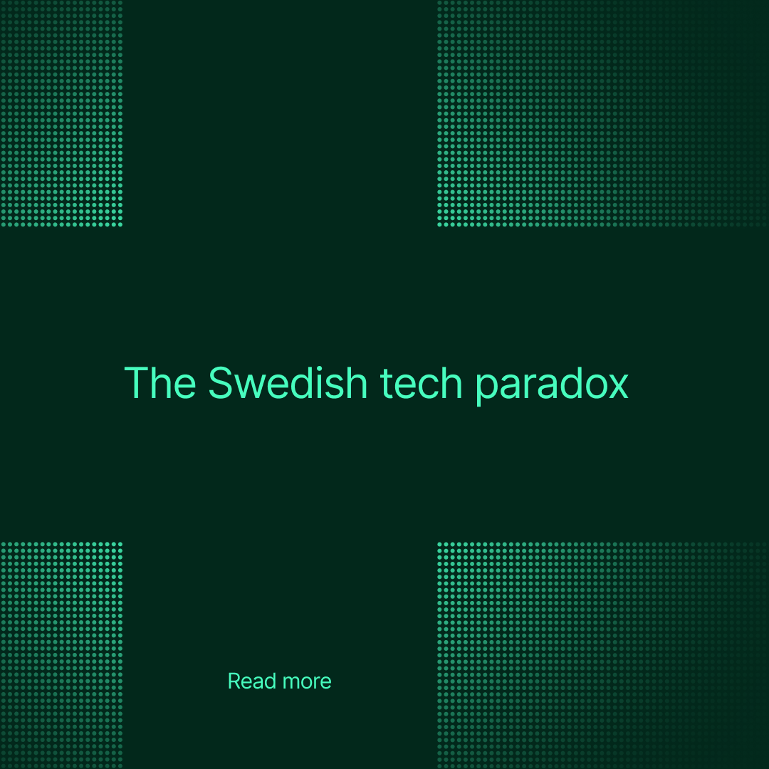
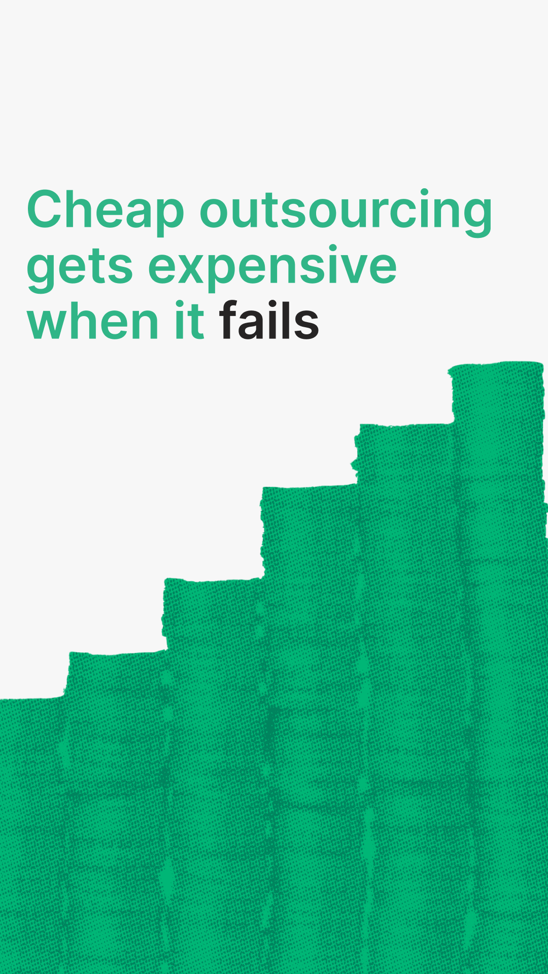
In a later batch, that same underlying effect evolved into a broader illustration style built around knurling, which let the ads carry visual interest and brand presence without relying on photography at all.

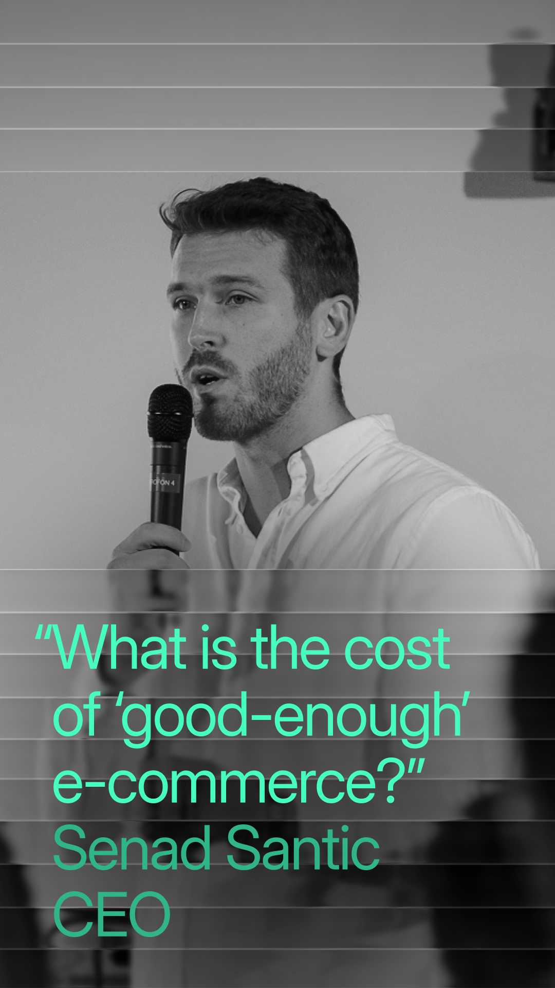
For ads that did use photography, I applied a layered glass effect over the images, which doubled as a scrim for text legibility and gave the photography a clean, modern finish consistent with the illustrated ads. Across all photography, color was isolated and pulled closer to the brand's palette, keeping every format, illustrated or photographic, visually unified under one system.
The Result:
The campaign reached 72 unique target accounts across both LinkedIn campaigns, generating genuine engagement from some of the most recognizable names on the account list, including Apple, ABB, DP World, Atlas Copco, and DSV. Apple alone accounted for 101 clicks, the single highest of any account reached.
The Effect:
A brand with no visual identity three months earlier was now getting noticed by some of the biggest names in its space.
Case Gallery